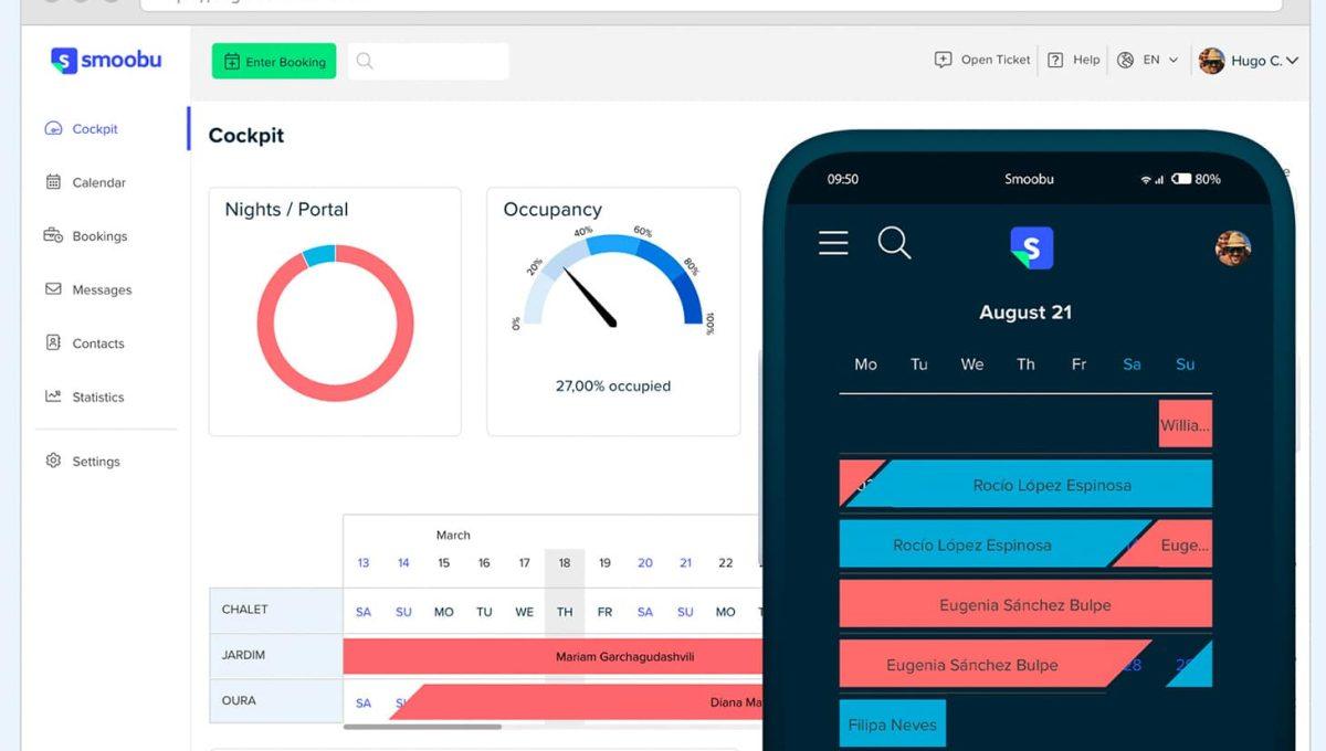
A brand new Smoobu - An intro to the new design
Today we are launching a new design and we are super excited to introduce you a whole new Smoobu!
Continuously improving functionality and usability of our software is part of our DNA. In the past, most of our upgrades were smaller and often not visible.
But today, we are launching a bigger release which will be highly visible to you! Here is a brief overview of what is new.
Not to worry, most of the layout remains the same and we are sure you will love the new changes.
In a nutshell
- We built a whole new design with a cleaner layout.
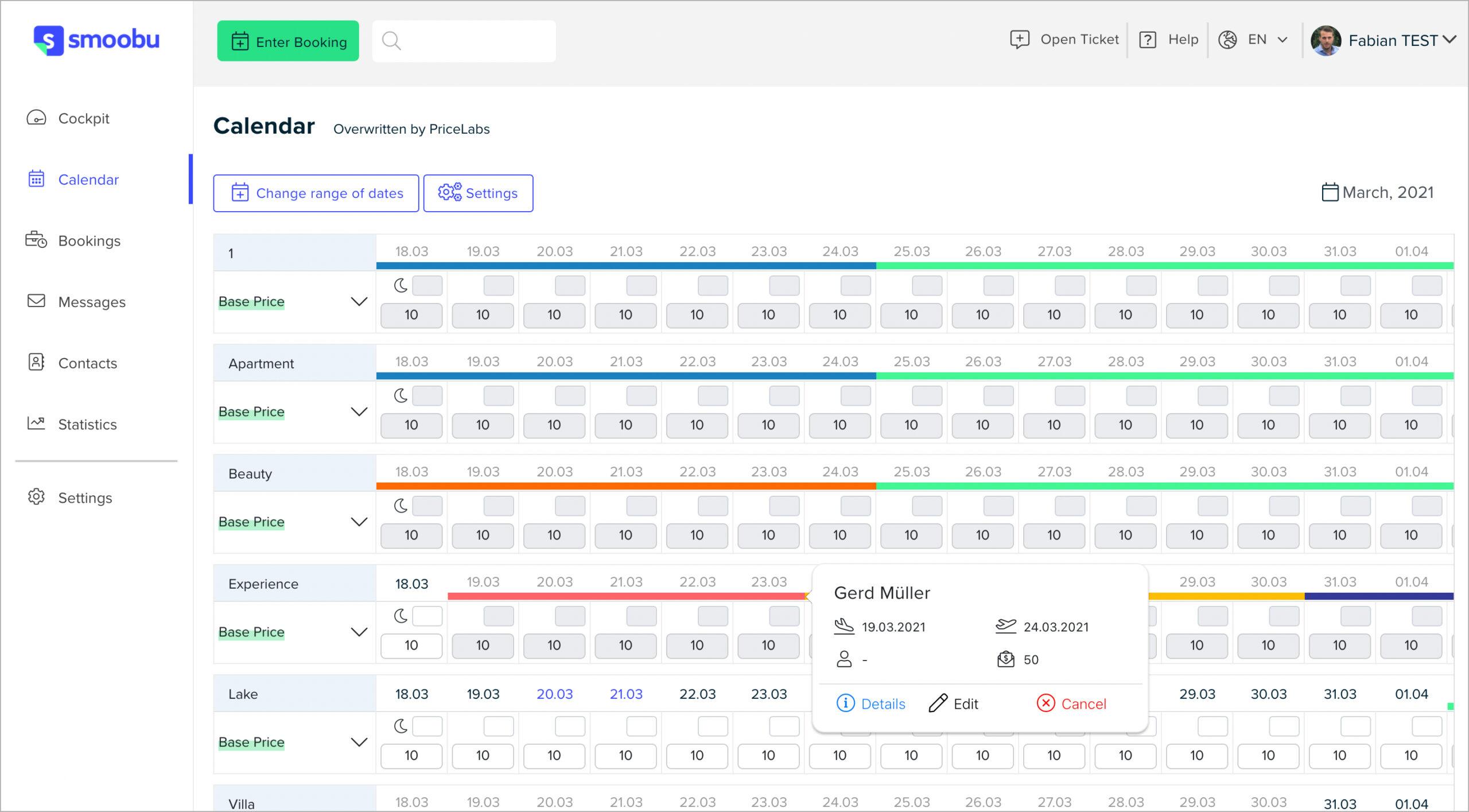
- We created better reservation tooltips.
- We now have a cleaner Booking Details page.
- We merged the Prices page into a brand-new calendar.
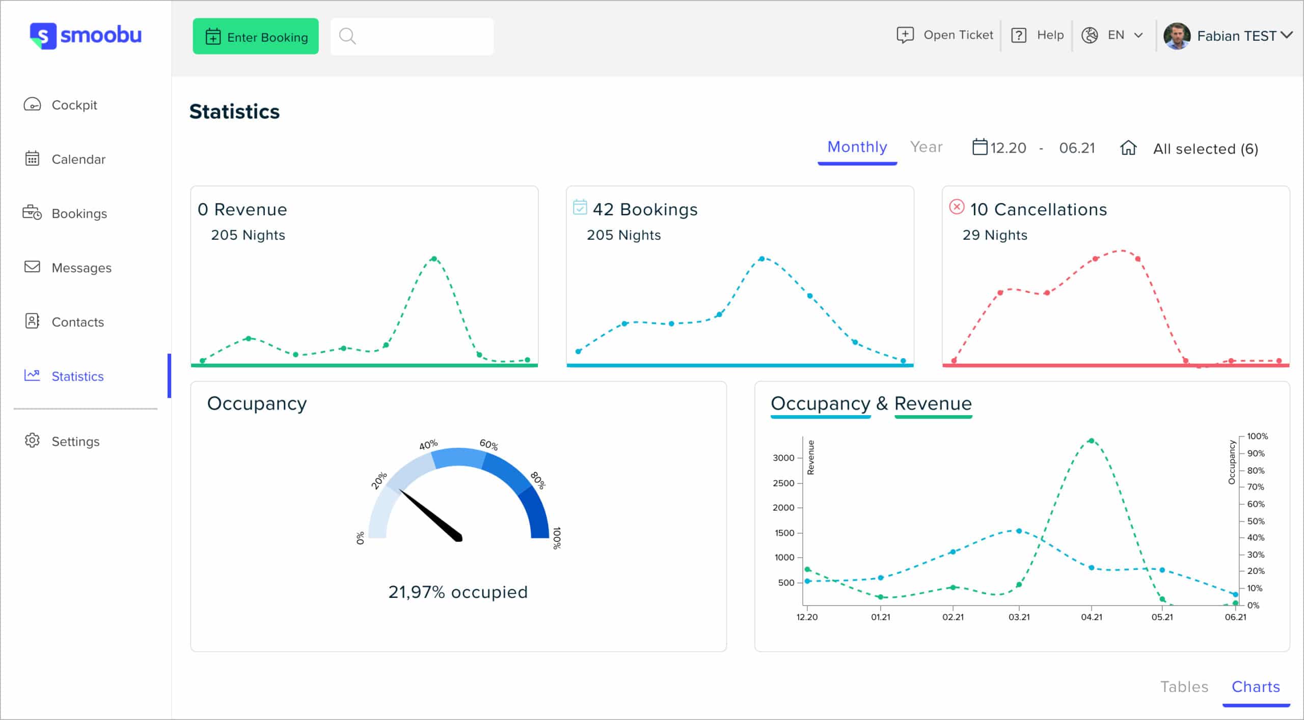
- We redesignedStatisticsand you now have more graphs and choices.
- We hid the navigation and streamline your view to see more content.
- We improved our Onboarding (guides, Airbnb setup).
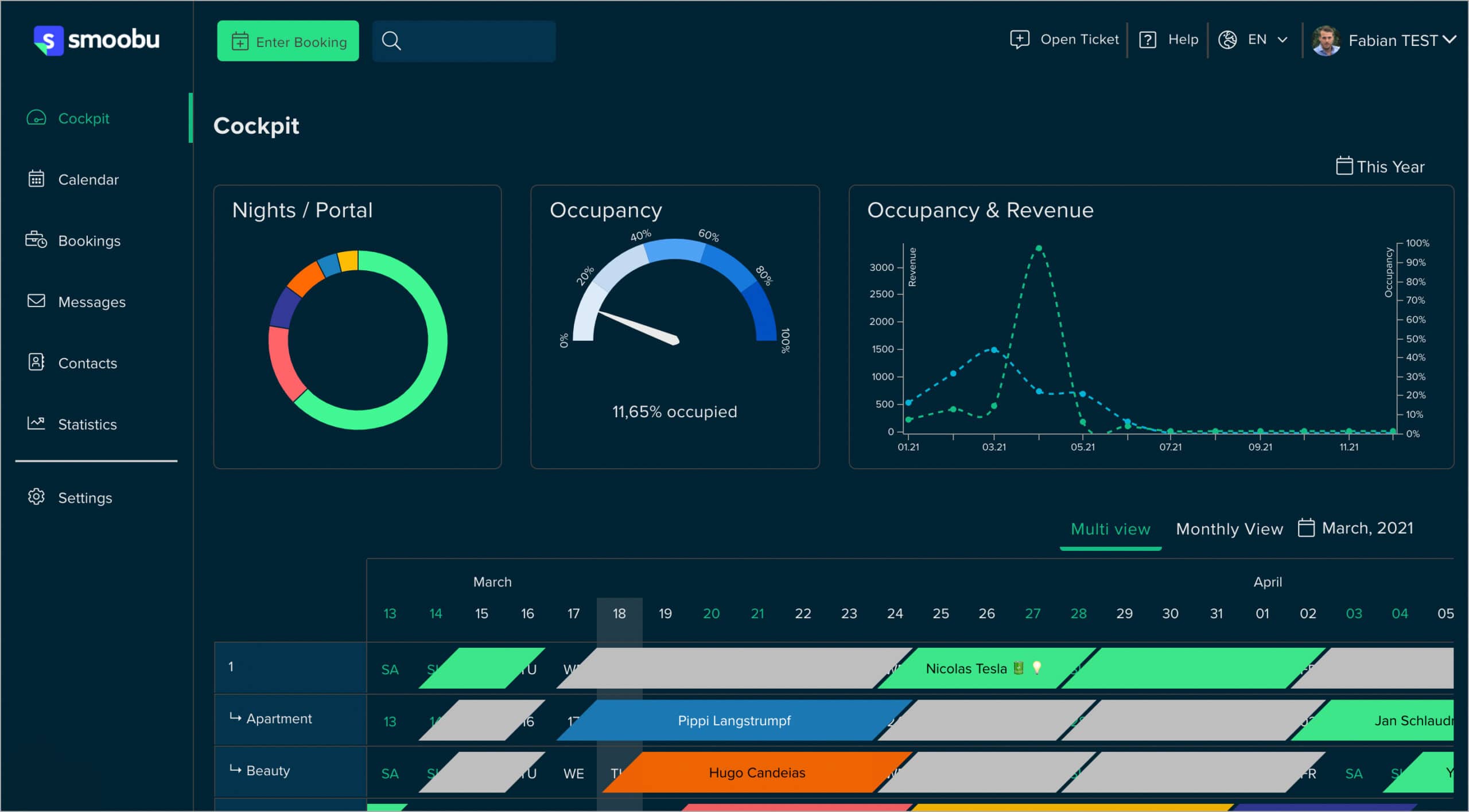
- We added a new Dark Mode.
And a lot more you may discover!
What's new in terms of functionality
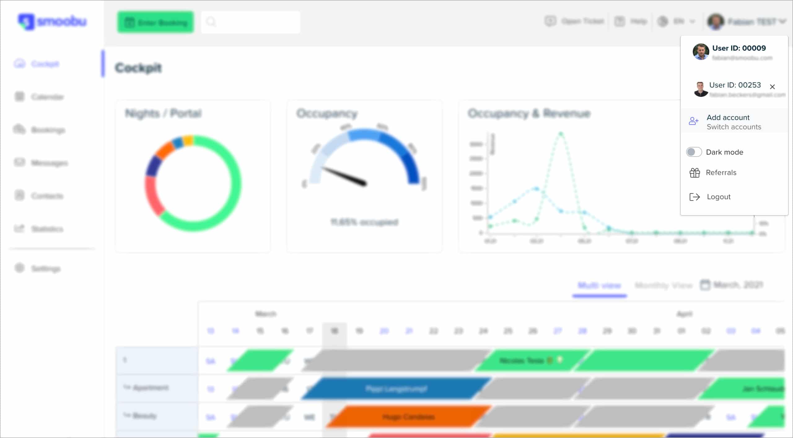
- If you have more than 1 account, you can now easily switch between them.
- Drag and drop reservations from one unit or date to another, and it will sync to portals.
- Statistics can be disabled in Cockpit if you prefer to see the calendar only (account settings).
- NewMessagingsection for better usability.
Additionally, we have doubled our servers to increase synchronization performance!
Introducing the new age of Smoobu
With this new design we’re evolving Smoobu's interface with a cleaner layout, uniform design system, more streamlined color palette and a lighter code base for faster load times in a whole new way.
This new aesthetic also better reflects the company we are today. Here's a sneak peek of the new layout:
Prices and availability: A better calendar view
Among other changes, the newly designed Price page now lets you directly access your bookings.
Switch between accounts easily
No more login and logouts. You can now easily switch multiple accounts in the profile drop-down menu.
Last but not least: Dark mode
The option to switch between White and Grey, reducing the brightness of colours. Colours are intended to catch attention, we are now using them for content elements that are worth your attention.
We have a dark mode now, too! Great for your eyes at night.
But we’re not done yet…
We are very happy to receive your feedback. Any release may come with a few small bugs, so we appreciate your help and understanding. We will continue to drive Smoobu, and make it work even better for you. Enjoy working with the newly updated Smoobu and let us know your thoughts.
2021 is just getting started and we can’t wait to show you everything else we have planned for this year. From a new website builder experience to improved booking tools, we have our most ambitious roadmap ahead of us. Stay tuned!
Leave a comment